Dekita!
Bringing the Wireframe to life
Over 12 Weeks I developed the Wireframe from my UX Project.
I created a Visual Language, Design System and other assets.
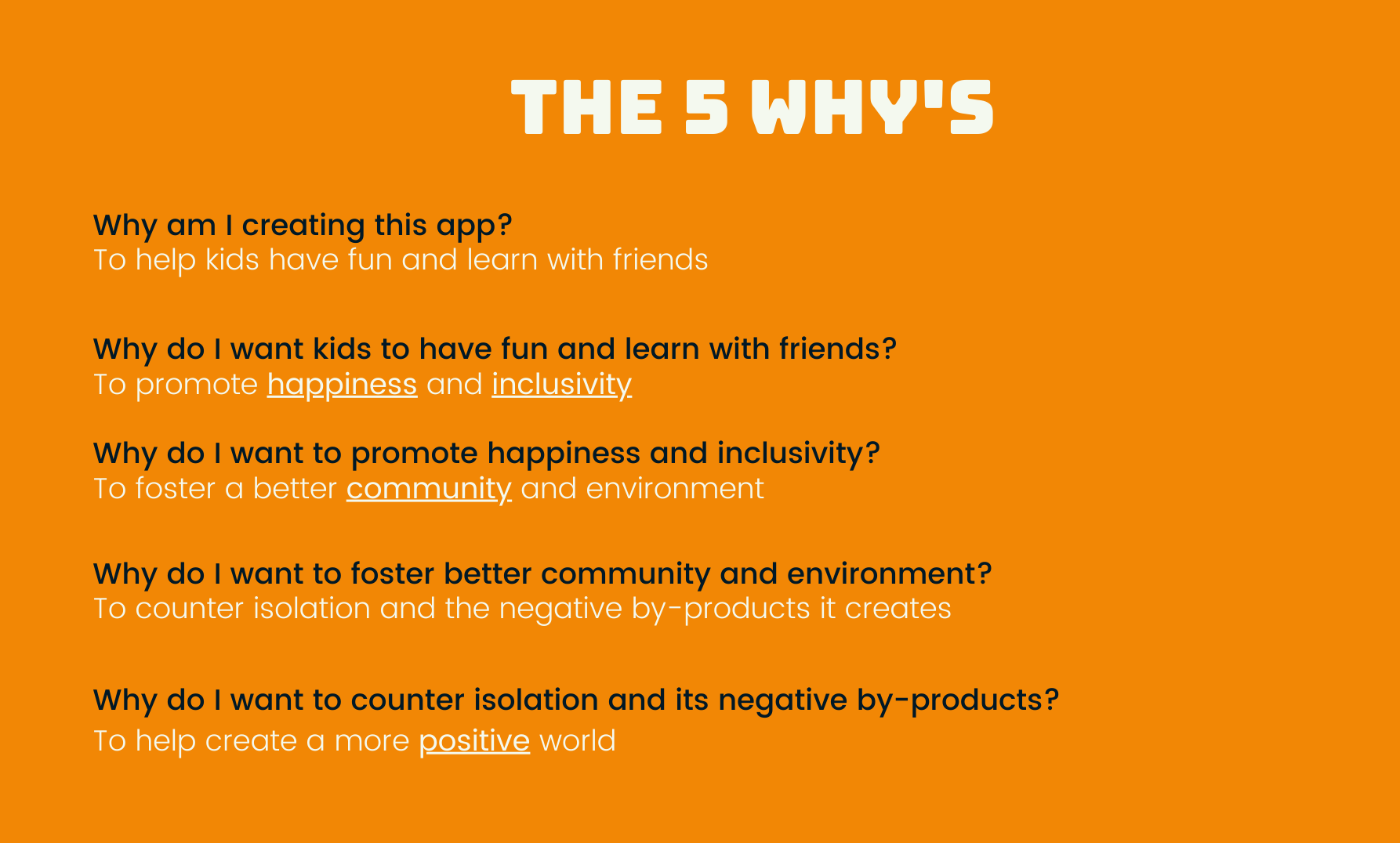
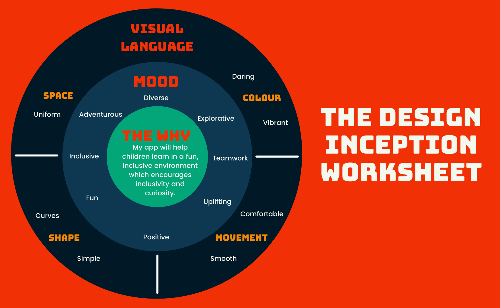
The 5 Whys and The Design Inception Worksheet.
I used the 5 Whys exercise to really determine the heart of the App and what I needed to convey.
Continuing from the 5 Whys I built up my Design Inception Worksheet. I used this worksheet as a guideline throughout the UI Project to ensure I was truly capturing the soul of the App with my visual language.
Exploration of Visual Language.
Colour Schemes.
I used Adobe Colour to create 5 colour schemes and to search pre-existing schemes using words from the Design Inception Worksheet. I also experimented with Astrology (for fun!) by pulling colours from the Natal Chart of my App.
Typography.
In Figma, I tried mocking up headers and paragraph text to see what font pairings I liked.
Icons.
With an initial colour scheme and themes, I decided to start drafting icons. Looking back on my process, I should have done this later on.
Narrative.
To help with art direction, I considered the game instructions I had defined in my UX Project. I then developed a narrative which I thought would suit the themes that I had identified from the Design Inception Worksheet.
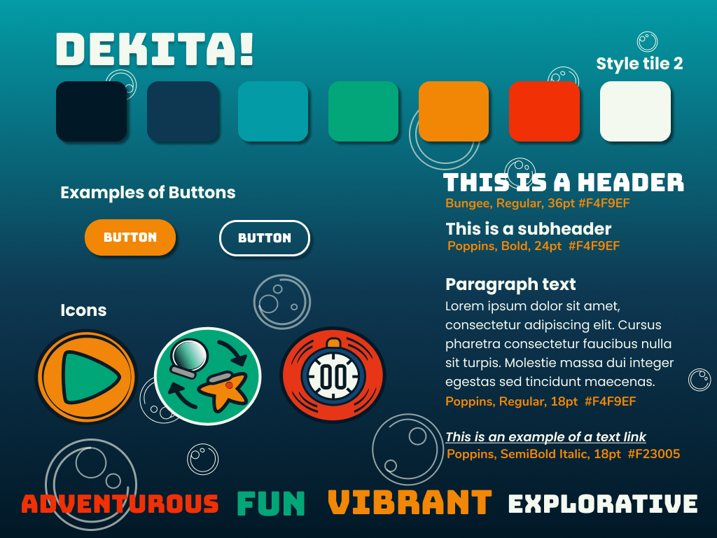
Mood Boards and Style Tiles.
I created a variety of mood boards and style tiles at this point in the process. Though I had already explored colour palettes, I tried to keep an open mind in case any new ideas came up. At this point in my project, it would have been useful to have a round of gut testing but we weren’t introduced to this concept until later in the journey.
The Name Game.
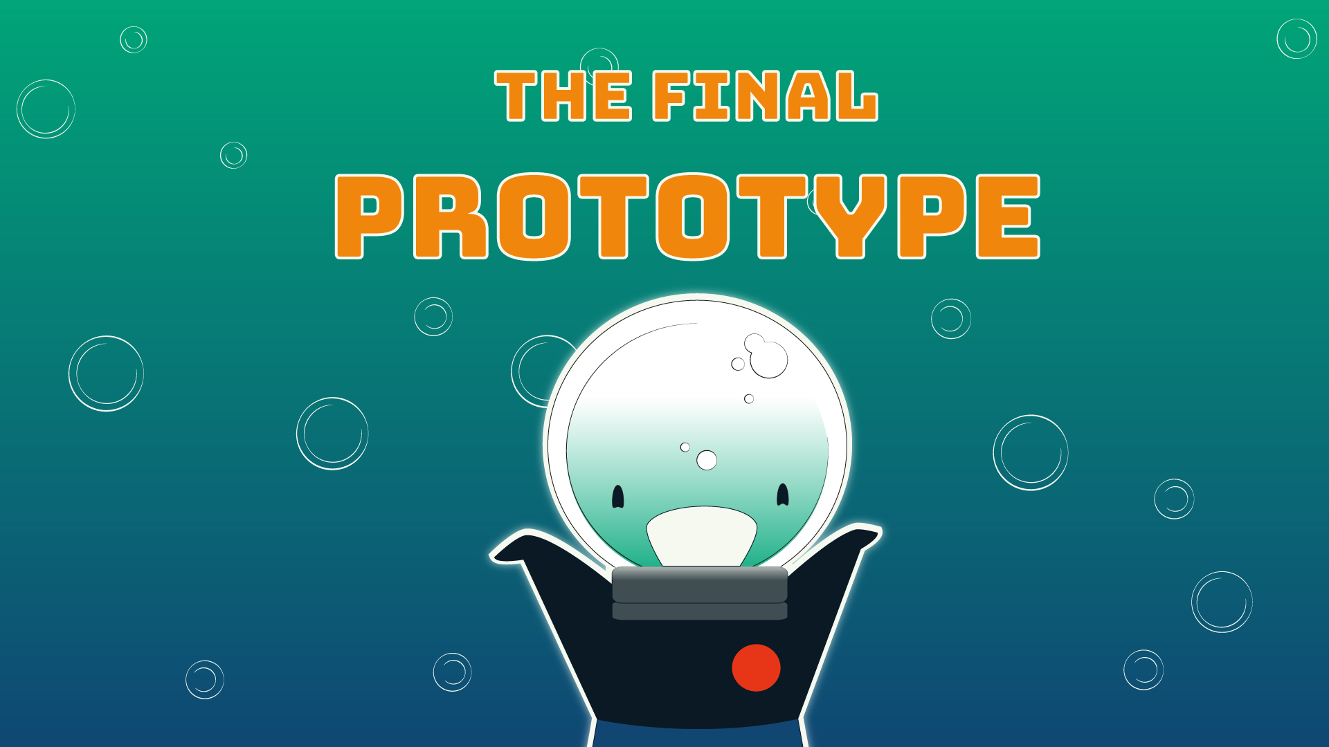
In order to help with the branding and artwork of the game, I needed a name. I considered a lot of different names to do with the games theme, but settled on the name “Dekita!” which is Japanese for “I did it!”. I decided to name the space ship in the game “Dekita” to tie it in.
Changes to the Wireframe.
Moving the Navigation Bar.
With the icons I had decided and the Font I had selected - the Navigation bar had become quite heavy in the Kid’s flow. I decided to move it to the bottom of the screen.
Making a Chat Overlay.
With my Navigation Bar at the bottom of the page, I considered moving it when a chat tab was clicked on. However, I wanted the navigation bar to stay fixed. So instead I used an Overlay.
Parent Navigation Bar.
In my final UX Wireframe the Parent’s flow used a lot of overlays and had no navigation bar. I decided to create one so Parent’s would have a better understanding of where they were in the app.
Design System.
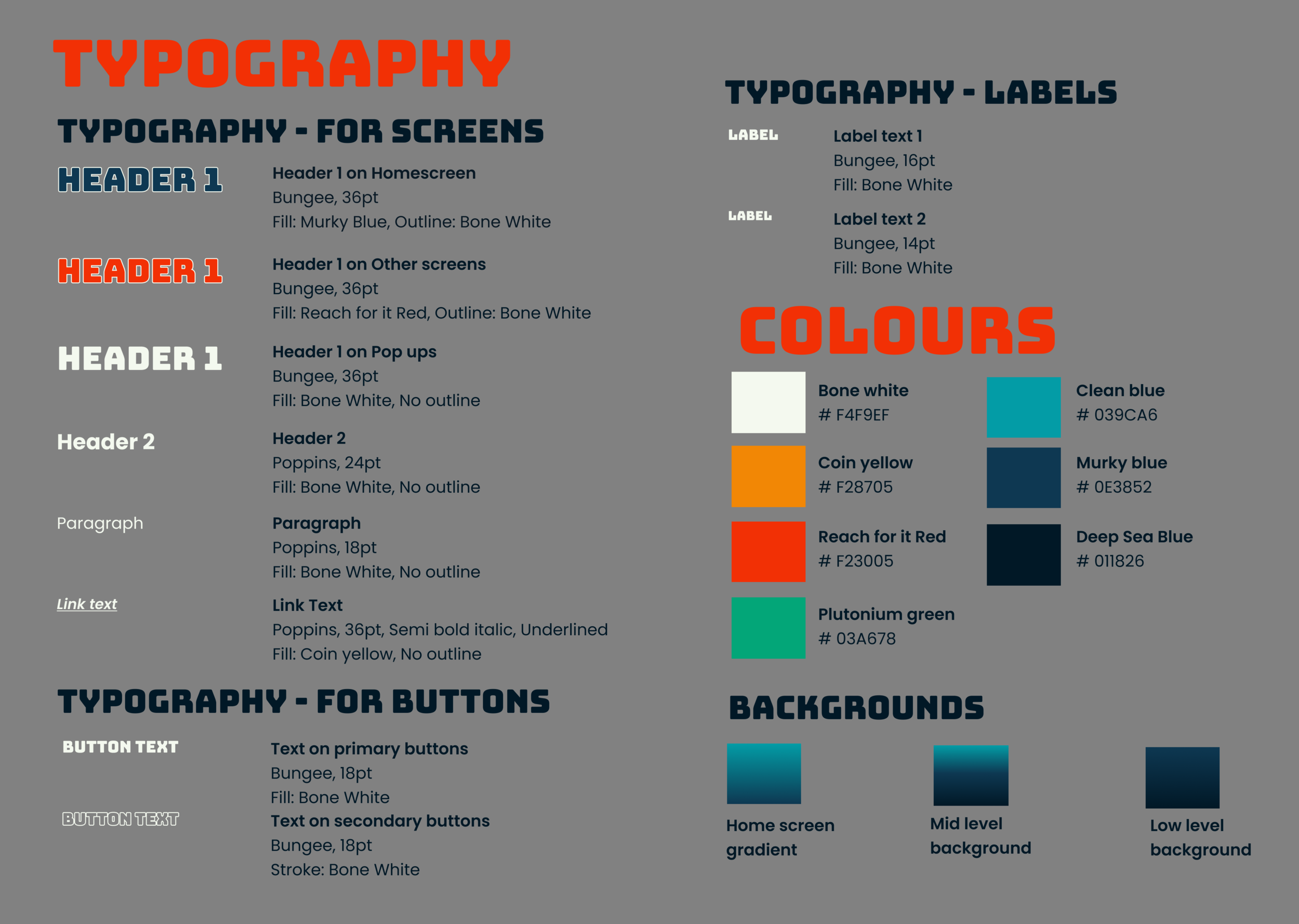
In order to populate my Wireframe with my Visual Language I created a Design System in Figma using Atomic Design Principles. This means I created smaller components such as Icons, Buttons and Typography Styles and then used them to create bigger components such as Forms, Navigation Bars and Pop ups.
Animations.
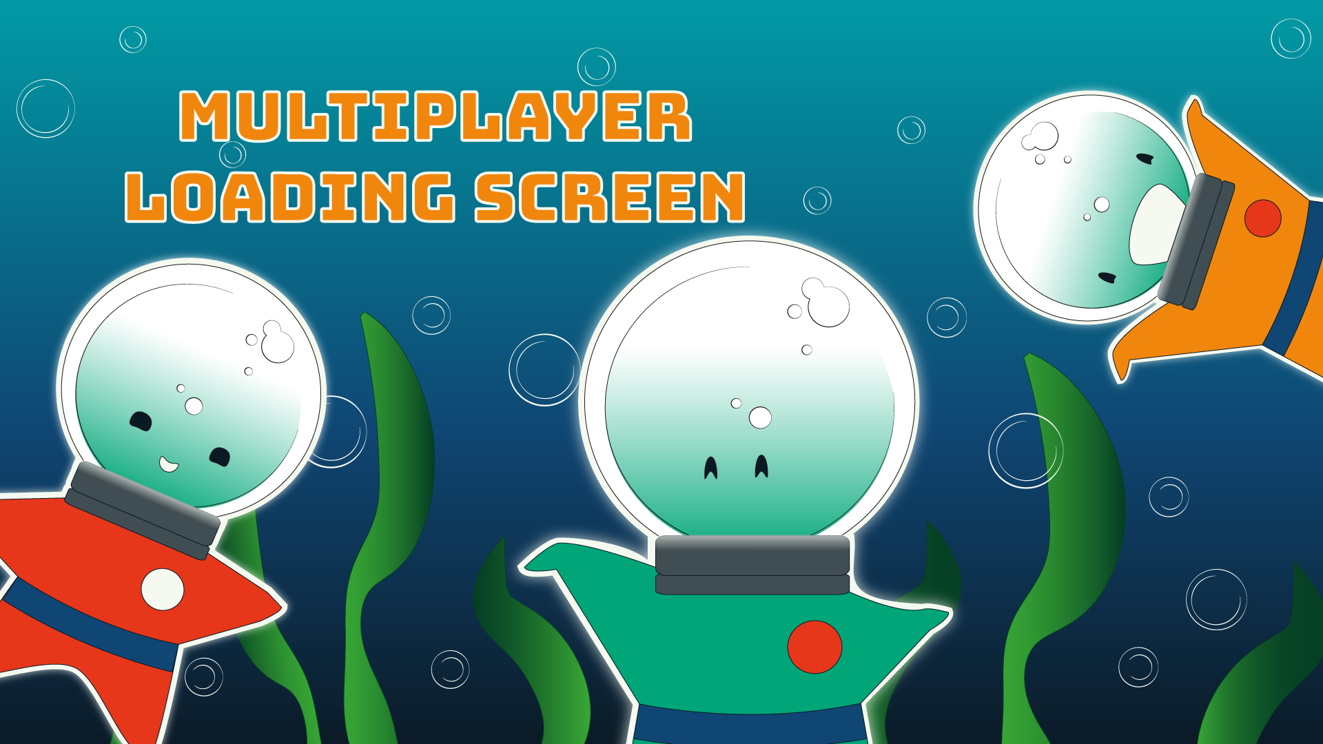
In order to add some fun elements to my Wireframe I designed some animations for transitions between screens, loading screens and buttons.
The End Result:
Watch a click-through of my final prototype or have a go yourself by viewing the clickable prototype in Figma.

